Revamp Order List

Improve the customer's post-purchase experiences in Orami Shopping
Overview

Orami has extended its product range beyond Moms' and Babies' needs, now offering digital products for household needs as well. As a result of this expansion, there is a need to update the post-purchase information, especially when users want to review their order history. Additionally, I believe it is an opportune moment to address some backlog of usability issues.

Role

In this project, I made contributions by conducting a platform audit, defining product scope, and creating high-fidelity mockups.

Tools

Sketch, Hotjar, Notion

Platform

Orami Shopping

HOW MIGHT WE

Deliver Orami Passport's identity as an in-company SSO to our users?

πŸ” business goals.

#1

Back then, each Orami platforms had their own login-register page with different interfaces and forms. Users might comprehended it as each platform was unique and required a different account, when in fact was not.

So, the solution that we like to try is to revamp a single login-register page that is suitable on all Orami platforms regardless of their function and devices.

#2

Parallel with the last goal, there was also an initiation to enforce email as one of our login-register method (previously, we only used phone numbers). The goal is to collect and optimize users' email data. Also, it will become an alternative methods for users besides phone numbers.

🎨 exploration & test.

/desktop research.

Did desktop research from other platforms to discover the login-register system, and how they handle specific cases related to account security.

Desktop Management Dashboard

/exploration-iteration-discussion.

In the process, I was helped by one of my UXΒ Designer senior, developer team, and our Head of Design. We did a lot of exploration, iteration, and discussion to get feedback as fast, as much as possible.

Over time we also discovered extra requirements and ideas, such as:

#1 - Verification flow

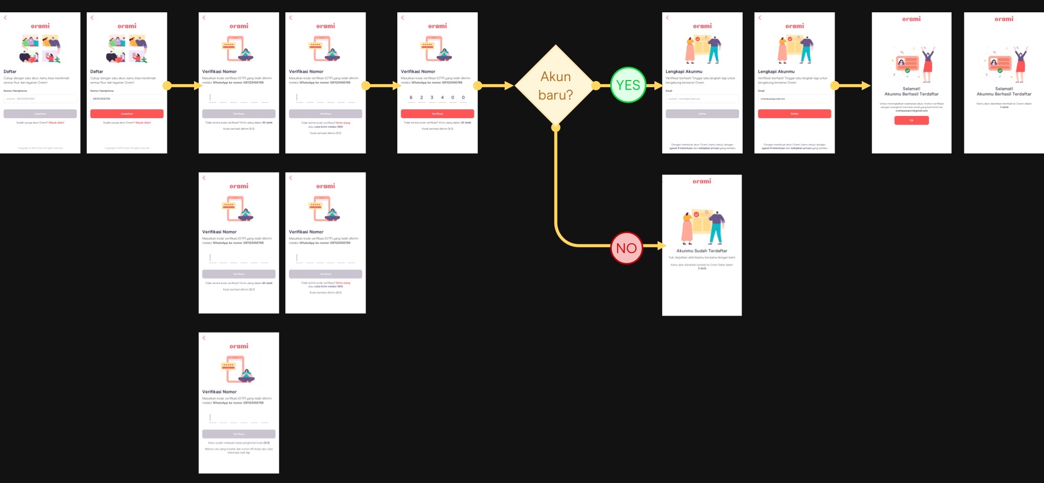
Improve the flow of verification to reduce operational cost.

#2 - Social SSO

Social SSO (single sign-on) option to support services in Orami that linked with social media account

#3 - Whitelabeling

To support uniqueness in each services while maintaining the unity of Orami Passport's identity.

Happy flow of login-register task
A few example of our first phase iteration
Iteration

/usability testing.

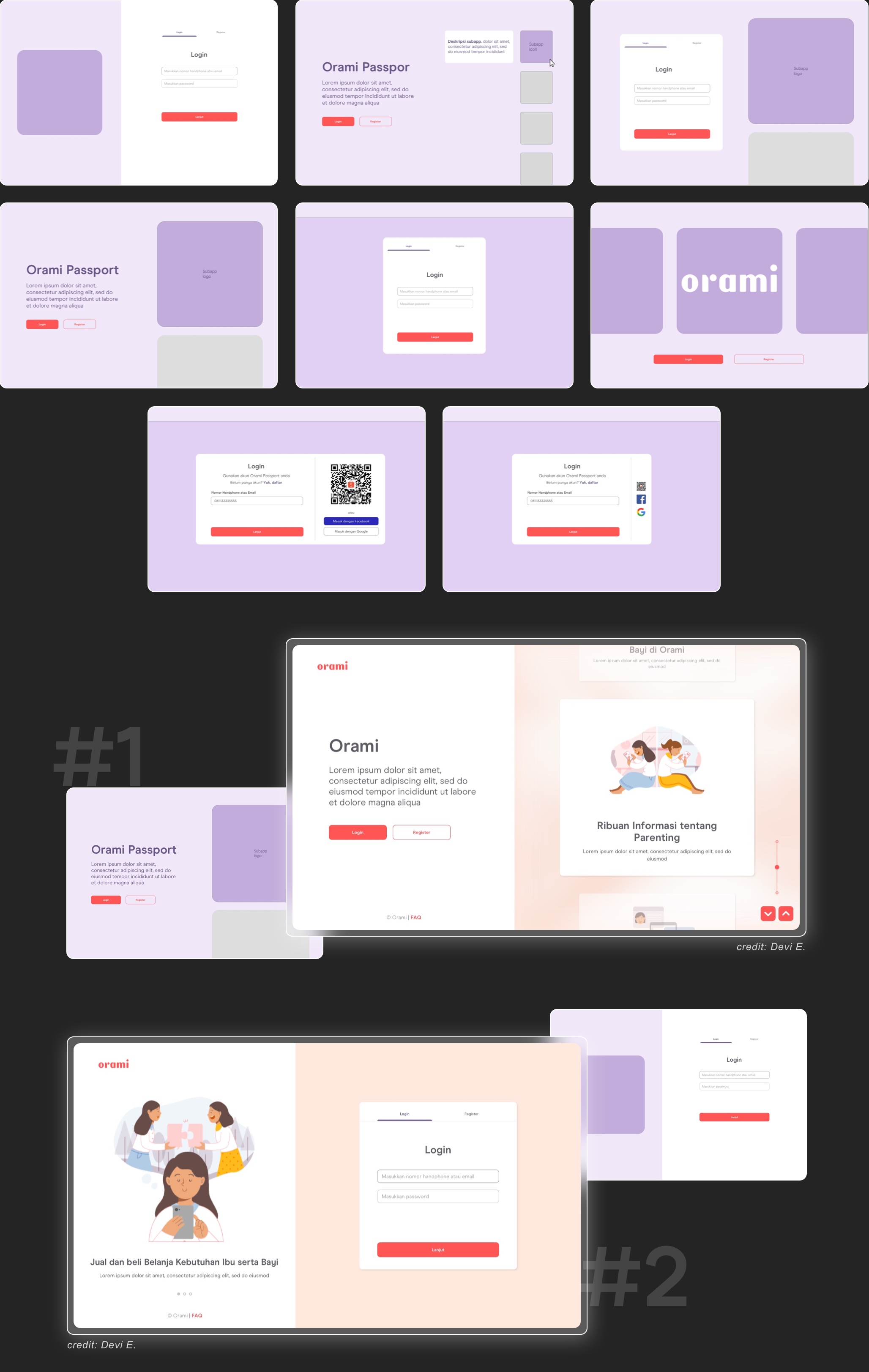
In the process, we had some sort of dilemma to determine between two options for the login page. The first one has a single field to input email or phone number and the other one has separate fields.

To validate which one works best for our users, we decided to do some quick-internal usability testing research. I and my friend were working on the research plan, recruiting internal participants, preparing prototypes, conducting the usability test, analyzing data research, and creating research result report.
‍
You can check the prototype's example in here

Mockup model
Internal UT resultInternal UTInternal UT

action plan:

Particularly, we implemented a single field to input phone number or email.
Login
Furthermore, we take into account a few improvements from the user's insight, such as..
To prevent users from filling in an unregistered Whatsapp number, it is necessary to give more to-the-point placeholder text about the registered number that the user should fill in.
Give more representative illustrations on the "Input OTP" page.
The social SSO button feels a bit distracting.

🎨 flow & final design.

/registration.
/login.

o1_responsiveness.

Not far from the former version we continue to design scalable interface for responsive screen, from mobile to desktop platform.
Responsive mobile desktop

02_whitelabeling.

To support uniqueness for each services while keeping the unity of Orami Passport, we differentiate the illustration and some wording that unique for each platform.
Whitelabeling example

03_verification

Based on the data, our users favorably used WhatsApp. So we took it as a potential to reduce operational costs by directly sending the verification code to user's Whatsapp. Another verification option is still available, yet it doesn't prominently visible.
Verfiication flow

/challenge.

The login & registration system is rather complicated. Because there are a few aspects that we need to consider, therefore assembling a balance between security needs, feasibility, and seamless experiences is pretty challenging. It requires a lot of discussion with stakeholders and rapid tweaking here and there.

πŸ” context.

/user's problem.

In a meet-up session with the product team, admin team reported records of mistake and human error while operating the current dashboard. Resulting in many unexpected or unwanted events, both for the admin team and customer side.

The presumed potential reason is because of difficulties when operating the dashboard. A few examples of the issues will be explained below.

/vision.

The context of current project is in line with former initiative to create an independent and centered management dashboard. It doesn't stop at managing complaints, but also for holistic setting and management in Orami environment
Problem & vision
BUSINESS PROPOSAL

Create a centralized & seamless Management Dashboard.

Showcase image

🧠 understand & define the requirement.

/usability issues.

Conducted audit activities to analyze the experience and find issues that the admin team might have in the existing dashboard.
Audit result

Information structure

Need more effort to proceed with all information at once because most actions were gathered on the same page and each option seems equal. The user might be perplexed about where they have to begin.

Proximity

Some actions that are associated with each other, were separated and looked disconnected. This condition may lead to a higher possibility of missing essential input.

Multi-interpretation term

Contained terms that have multi-interpretation meanings. If the admin misinterprets the term, it will probably causing an unanticipated event.

This is some text inside of a div block.
"In short, the existing dashboard has fulfilled most of the function but they require heavy cognitive load."

Even though the product team also provided a written tutorial guide, just in case, it was still quite a hassle to check the guide every time.

/analyze the system of managing complaint.

By create a hypothetic blueprint of complaint management system, allows me to understand how the system works and identify the existing gaps and opportunities. Also, it helps me gain more precise expectations and scope before exploring the dashboard.
Existing system of complaints investigation

🎨 exploration activities.

/improving flow.

Next, I planned the flow for main tasks such as investigating complaint, giving solutions and sending requests for additional proof. In this phase, I was also collecting ideas for components and elements needed in specific steps.
Proposed user flow of investigating complaint and giving solution

/layout exploration.

I began the first ideation of main pages by sketching out layouts and continued the exploration with a wireframe and low fidelity mockup.

/detail dispute page

For the scalability, I tried considering the sidebar component because it is one of the mandatory element that surely will be put on later when the dashboard improve its feature
Ideation 1

/homepage.

Besides the table list of complaints, we add widget overview complaints as a filter shortcut.
Ideation 2

/popup resolution.

Provide an intuitive steps when choosing a solution.
Ideation 3

πŸ” evaluate.

/usability testing

After we finished the first design phase, we did usability testing with the admin team joined us as participant. The goal is to...

1. Validate our solution of managing complaint task
2. Get insights, pain points, and needs as an improvement material
3. Understand the holistic experiences of managing complaint
Together with UX Researcher, we prepared the research plan and questions. The researcher gave a hand with the post-preparation such as timeline, searching for participants and setting the interview schedule. For the session itself, my researcher friend conducted the interview while I was responsible for note-taking. Next, we divided the task in the grouping and analyzing data. Finally, the research result was done by the researcher.
Usability testing document example

01. overview of new Complaint Management dashboard

Detail of management dashboard

02. updated progress and additional info for customer

Overview 2

03. simplifying setting complaint status

Overview 3

04. send request for additional proof

Overview 4
OBJECTIVE

Improving the experience of checking orders while accommodating to the new information at a time

πŸ” problems & insights discovery.

/needs.

variative information

The moms and babies products, as well as household digital products, have slightly differ information, particularly in their category structure. As a consequence, the structure of card orders varies, which is not the most optimal implementation. This inconsistency in presenting information can be confusing for users who typically expect to find consistent information in the same location.

user's insight

During one of our user research sessions, we gained valuable insights regarding the Order List page. It came to our attention that users encounter difficulties when navigating back and forth between the Order List page and the Detail Order page in order to search of a specific order.
Current card order have different structure information based on its product

/performance analysis.

The performance analysis results obtained from Hotjar have been useful in guiding my decision-making, especially in these two key areas:
‍
β€’ I have been able to determine which components are essential to retain and which components can be removed with minimal problems.
β€’ I have been able to establish a renewed composition of the visual hierarchy
Hotjar data

scroll heatmap

The scroll heatmap analysis reveals that users typically scroll through the order list page until they view 3 to 4 card orders.
Additional evidence as to why we should make the card design more compact. By doing so, users will be able to see more cards within their regular scrolling activity.

click heatmap

Insights about actions that users frequently perform and not, sorted by the level of user activity (descending):
1. The "Lihat detail" text button is the most frequently clicked component.
2. The store name.
3. The "Awaiting payment" section.
4. The order number.
5. The order status, invoice, and the buttons "Beri review" and "Beli lagi" have similar click rates.
These findings provide valuable information about the user's interaction preferences and can guide us in optimizing the design and placement of these components.

/audit results.

visual hierachy

In light of the evolving needs, it is necessary to reevaluate the existing visual hierarchy.
‍
For example, based on the performance analysis, we found that the Affiliation Category, Order Number, and Date Order have relatively lower levels of interaction compared to other elements. However, despite their lower interaction rates, it is important to prominently display them. Therefore, we willrefine it to a more subtle presentation.e text inside of a div block.
This is some text inside of a div block.

less relevant elements

We have taken steps to simplify the card design by removing less essential components or transforming them into more significant functions.

β€’ The "Lihat Detail" text button has been eliminated to streamline the card. Now, the entire card order is clickable, providing a seamless user experience.
β€’ The invoice information has been removed from the card as it is seemed less necessary for users in this page.

awaiting payment

Based on performance analysis, the "Awaiting Payment" section has shown a high level of user interaction. Therefore, we will optimized this section.

πŸ” proposed design.

redesign structure layout of card order

Removing non-essential components, resulting in a more compact card design
Rearrange the card, giving careful consideration to the hierarchy of information
Ensure consistency in the card layout across different product variants
Adhere to the design system rules for element sizes and colors
Integrate the Product Preview section developed by another team
Utilize illustrations to enhance the presentation of digital products

status order indicator

Improve the color scheme of the order status to enhance intuitiveness. Utilizing appropriate colors can effectively represent the corresponding order status, allowing users to quickly understand the status of their orders.

waiting payment section

To enhance the usability and prominence of this section, we have added a preview of the order at the forefront. By doing so, users can easily identify the unfinished order and its corresponding price when visiting the order list page.

track order preview

Users can now track their orders directly from the Order List page. This saves users from the need to navigate to the Detail Order page.

more works.