
.jpg)
Orami Passport is an in-company SSO technology where users can use a single id to access all platforms in Orami environment. Yet as a centered system, it didn't look like as one. The differentiation that each platform had, might potentially cause impacts on brand identity, user experience, even data system.
In response to that, we want to enhance the awareness of Orami Passport as a centered-authentication system to our users.
In collaboration with a UX Designer comrade. Together we did exploration and created mediums from wireframe, lo-fi to hi-fi mockup, prototyping, and conducted internal research.
Sketch, Maze, Google Meet
Orami
Did desktop research from other platforms to discover the login-register system, and how they handle specific cases related to account security.

In the process, I was helped by one of my UX Designer senior, developer team, and our Head of Design. We did a lot of exploration, iteration, and discussion to get feedback as fast, as much as possible.
Over time we also discovered extra requirements and ideas, such as:
Improve the flow of verification to reduce operational cost.
Social SSO (single sign-on) option to support services in Orami that linked with social media account
To support uniqueness in each services while maintaining the unity of Orami Passport's identity.

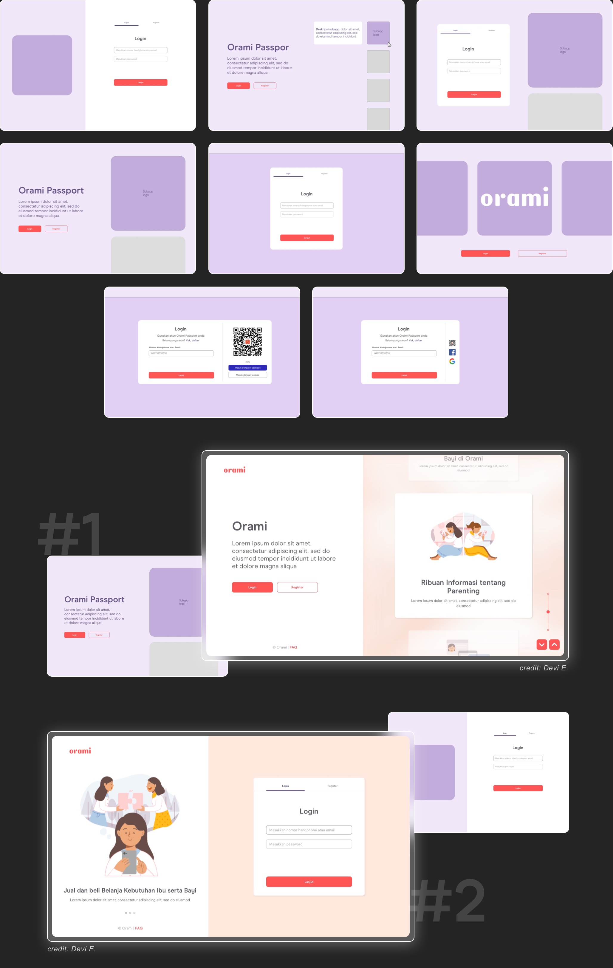
In the process, we had some sort of dilemma to determine between two options for the login page. The first one has a single field to input email or phone number and the other one has separate fields.
To validate which one works best for our users, we decided to do some quick-internal usability testing research. I and my friend were working on the research plan, recruiting internal participants, preparing prototypes, conducting the usability test, analyzing data research, and creating research result report.
You can check the prototype's example in here

.jpg)

.jpg)
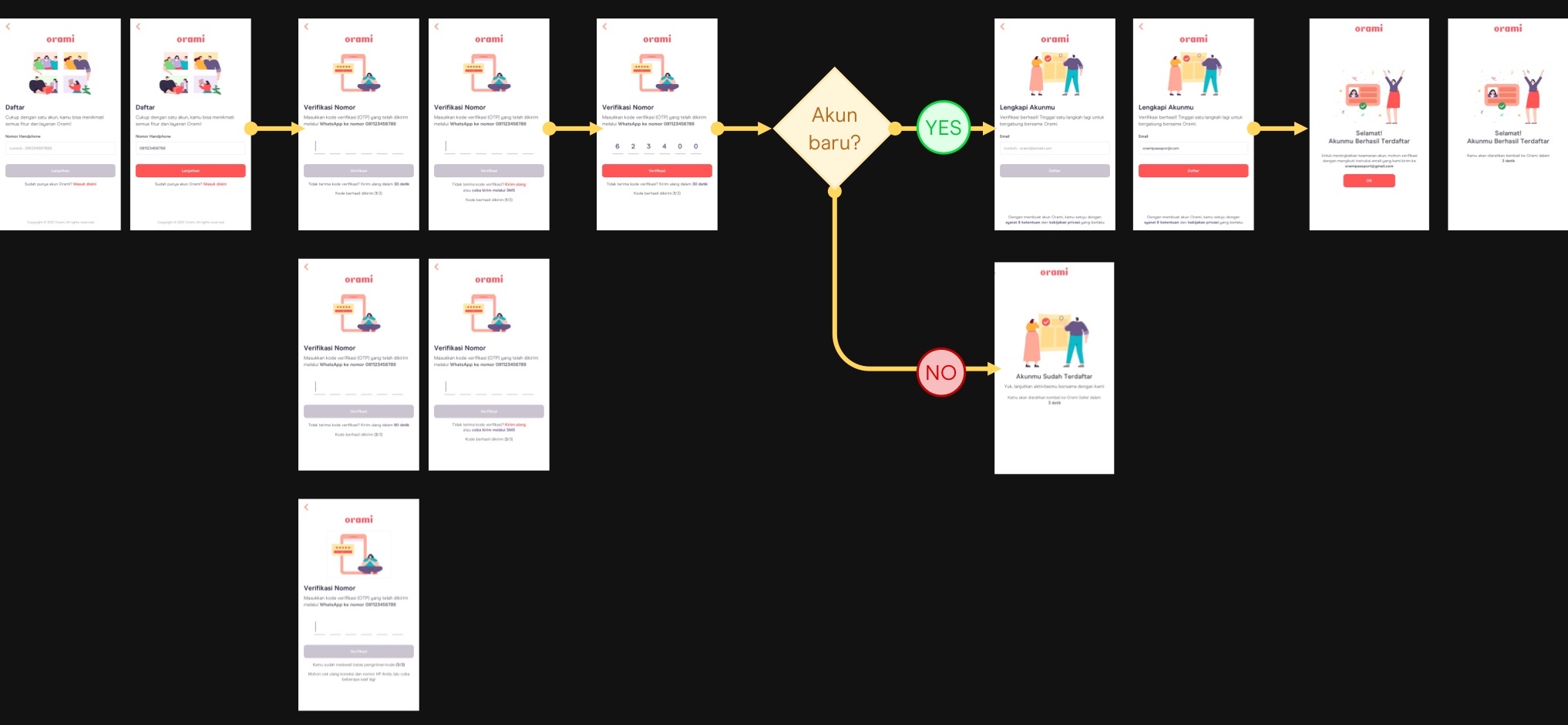


The login & registration system is rather complicated. Because there are a few aspects that we need to consider, therefore assembling a balance between security needs, feasibility, and seamless experiences is pretty challenging. It requires a lot of discussion with stakeholders and rapid tweaking here and there.


.png)
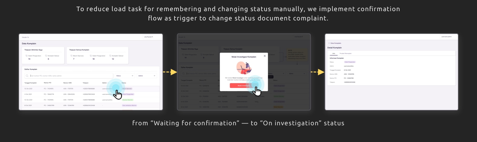
Need more effort to proceed with all information at once because most actions were gathered on the same page and each option seems equal. The user might be perplexed about where they have to begin.
Some actions that are associated with each other, were separated and looked disconnected. This condition may lead to a higher possibility of missing essential input.
Contained terms that have multi-interpretation meanings. If the admin misinterprets the term, it will probably causing an unanticipated event.


The scroll heatmap analysis reveals that users typically scroll through the order list page until they view 3 to 4 card orders.
1. The "Lihat detail" text button is the most frequently clicked component.
2. The store name.
3. The "Awaiting payment" section.
4. The order number.
5. The order status, invoice, and the buttons "Beri review" and "Beli lagi" have similar click rates.


